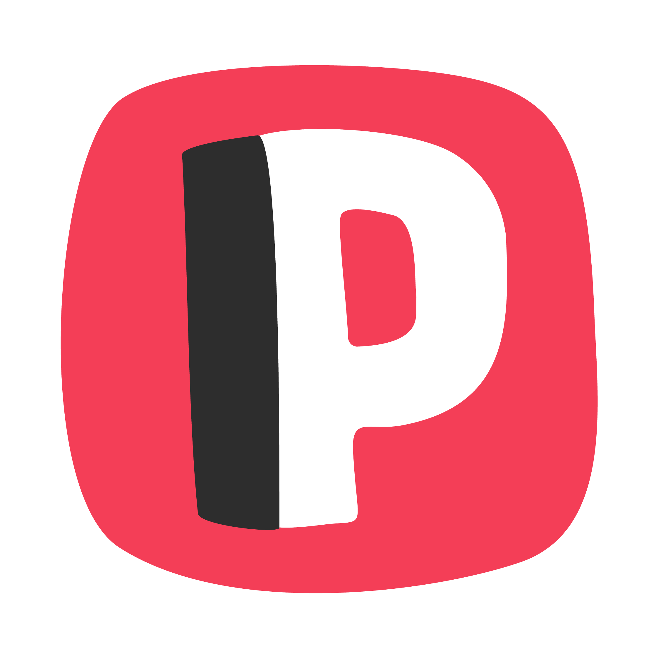
“Perfectly Imperfect” Design Is Taking Over
In a digital world dominated by AI precision, pixel-perfect templates, and clean minimalism, a surprising trend is rising: perfect imperfection.
Inspired by the Japanese philosophy of wabi-sabi, this design aesthetic embraces the beauty of the organic, the asymmetrical, and the hand-made. From rough brush strokes and irregular shapes to visible textures and human quirks, brands are rediscovering the power of authenticity through design.
Why the shift? As AI-generated visuals flood the market, audiences are craving something real. Something that feels like it came from a person, not a prompt. That means illustrations that look hand-drawn, typography that feels custom, and branding that dares to be a little off-centre — not by mistake, but by intention.
This isn’t about being unprofessional. It’s about being relatable. For startups, solo founders, and teams trying to cut through the noise, a slightly rawer visual identity can actually feel more trustworthy. It shows there’s a human behind the brand — someone who cares more about connection than perfection.
From fashion to fintech, this trend is showing up across industries. Brands are even pairing high-tech products with handmade design elements to bridge the gap between future and familiar.
What does this mean for your brand?
If your brand feels too clean or polished, consider adding some texture. Try custom illustrations, hand-lettered typography, or layout choices that breathe — and break the grid.
Imperfection isn’t a flaw. It can be your superpower.
The Rise of Branding Without Logos
For decades, the logo was the crown jewel of brand identity. But in 2025, a new approach is gaining momentum: brand identities that don’t rely on logos at all.
Think of it as “logo-optional branding.” Instead of one central symbol, brands are leaning into flexible systems built around colour palettes, custom type, voice, motion, and layout. The goal? To create instantly recognisable experiences — without depending on a single visual mark.
Why the shift? As design systems become more adaptive across platforms (from AR/VR to dark mode UIs), static logos don’t always scale well. In fact, some companies are removing their logo from mobile apps, replacing them with initials, emojis, or contextual icons that better fit small screens.
Another reason? Over-saturation. The world is filled with lookalike logos — clean sans-serifs in geometric shapes. Bold brands are standing out by abandoning logos in favour of more expressive elements. Think of Spotify’s green gradient, Monzo’s duotone colour block, or Mailchimp’s quirky illustrations — all of which carry the brand without a logo.
The takeaway
For freelancers and smaller brands, this is empowering. It means you don’t need to obsess over crafting the “perfect” mark. Instead, focus on creating a recognisable vibe — something people feel when they see your visuals, read your copy, or interact with your design.
Logos still matter — but in 2025, they’re no longer the hero. They’re one of many tools in a designer’s kit to build something memorable.
